
Nearly six months after the first COVID-19 outbreak in the United States, there is still some confusion and contradicting claims about the impact of the virus and approaches on containment. To some extent, lingering questions about the virus need more time and research to be answered, however there are several correctable COVID-19 fallacies that have emerged as a result of either data-less claims or misinterpretations of data. By analyzing coronavirus data, I’ve attempted to paint a comprehensive picture of COVID-19’s impact including where the virus has been most prevalent, where the virus has been most lethal, and the factors that contribute to increased death rates.
The data sources used in the following analyses are linked at the bottom.
We’ll begin by looking at the U.S. COVID-19 cases and deaths per week over time. To date, the United States has confirmed 6 million positive cases resulting in 183 thousand deaths and leaving an estimated overall mortality rate of 3% of confirmed cases. The below chart indicates the U.S. has experienced two waves of high-volume positive cases. The second wave in the summer resulted in fewer death totals compared to the spring, despite a higher number of cases.
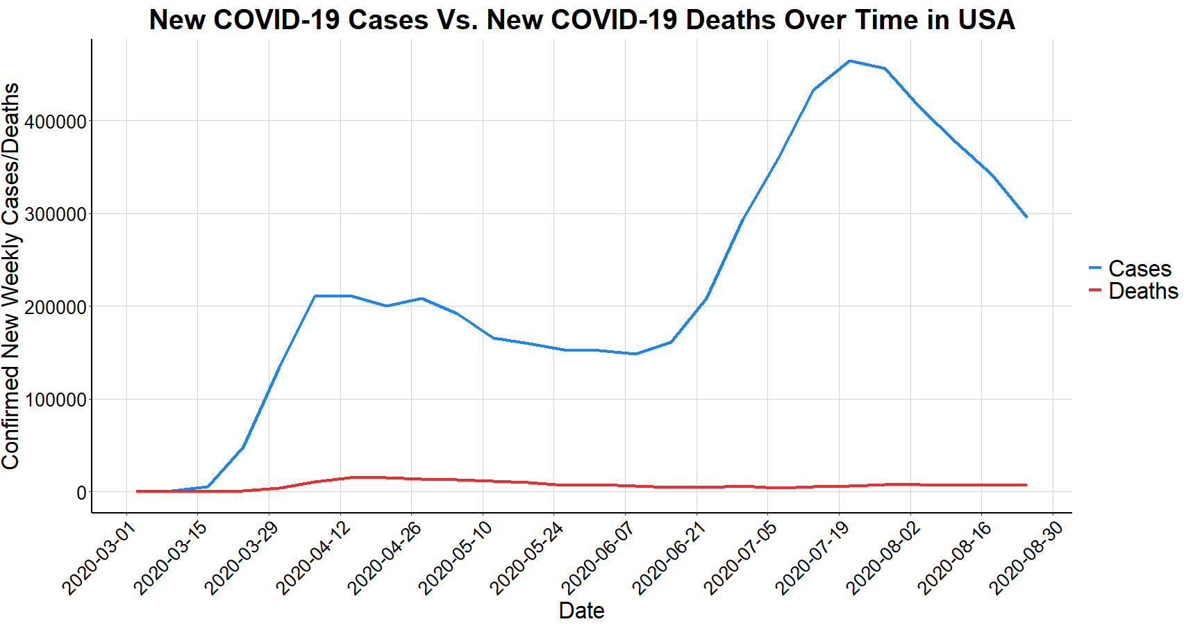
** We’ll later see that the apparent second wave is not actually a complete second wave, but primarily the first wave in different states.
The below chart shows the improvement in reducing the ratio of deaths per case over time. While partially due to increased testing, most countries are now seeing death rates of around 1-2% compared to above 5% for much of the first few months.
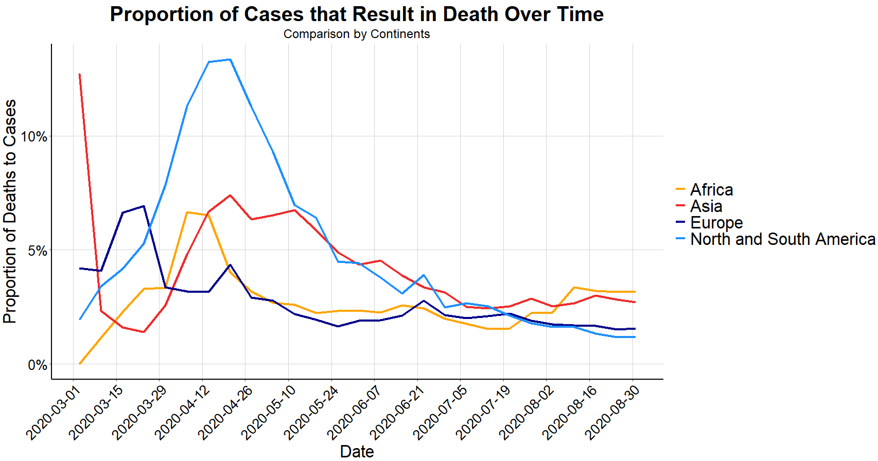
** These are upper-echelon estimates since not everyone infected gets tested, but every COVID-19 death does count as a case.
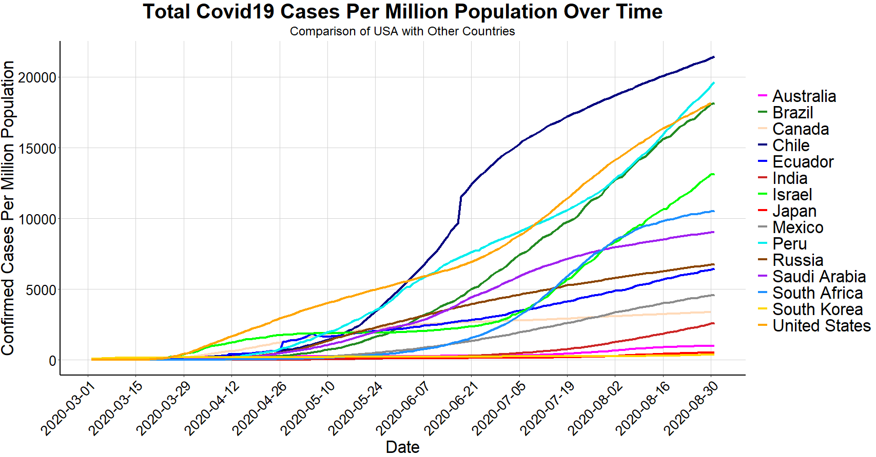
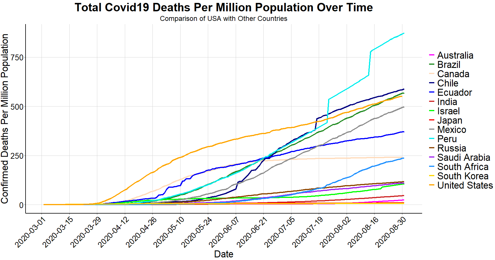
Next, we’ll look at how the United States COVID-19 metrics compare against the countries of Western Europe. Using total counts by country can be misleading and does not account for population sizes. Therefore, the following charts use population adjusted metrics. The chart below shows the United States has far more coronavirus cases, population adjusted, when compared to its Western European counterparts, however does this mean that the U.S. is truly doing the worst? This depends on your definition of success and failure.
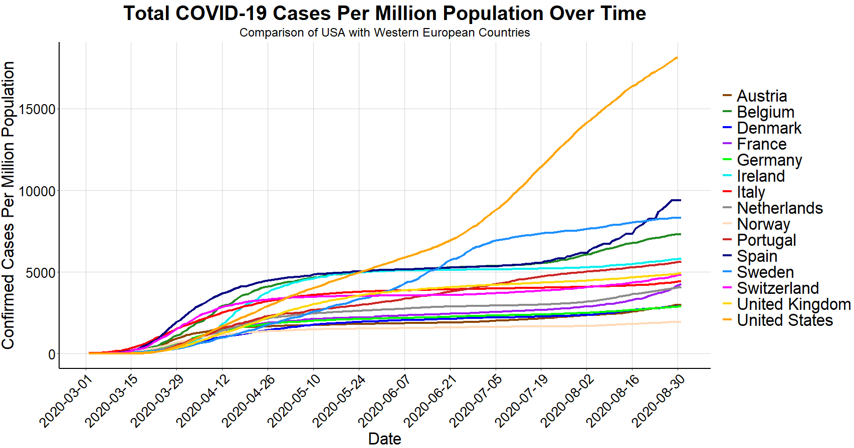
When highlighting several non-population adjusted metrics and valuing COVID-19 case count metrics with the same or greater importance as death count metrics, the Washington Post made the claim that the “pandemic has been worse in the U.S. than nearly any other country.” Conversely, President Trump has made several statements, notably in his interview with Axios that the U.S. has Coronavirus under control and is doing well, citing that our higher number of tests are inflating our number of positive cases relative to other countries. As it turns out, both claims cherry-pick convenient data to support a predetermined narrative while ignoring or downplaying other countering data, and the reality is that our COVID-19 outlook falls somewhere in between.
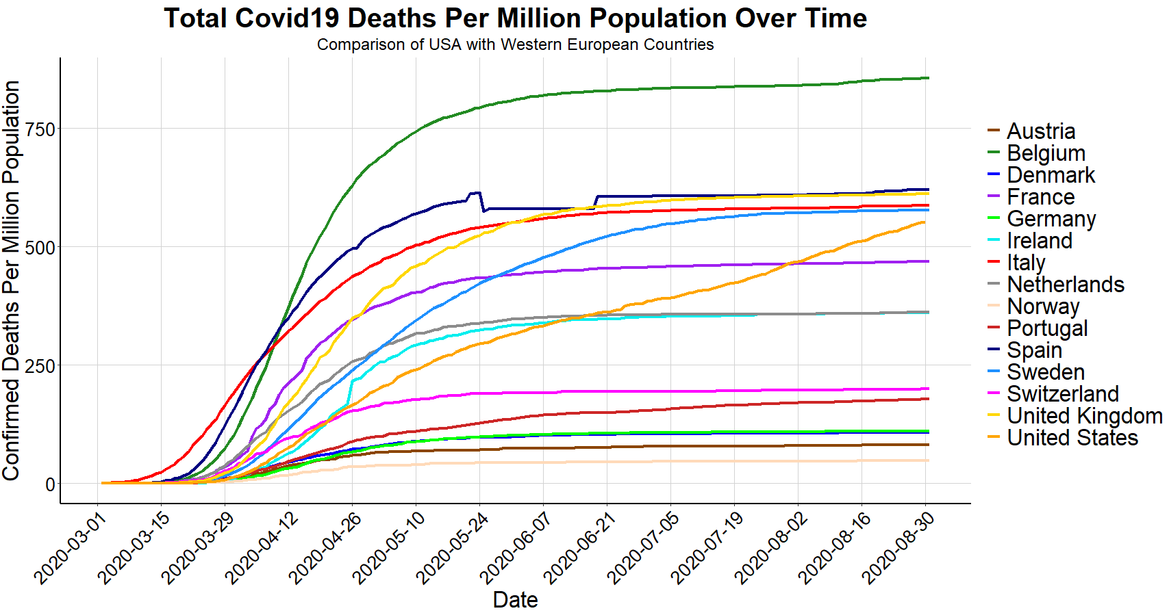
There are three distinct ways to define success when it comes to dealing with COVID-19; minimize the timeframe of positive cases, minimize the number of cases, or minimize the number of deaths, and none of which are perfectly correlated as we’ve seen from the above charts. My assertion is that the correct standard of success should be to minimize the number of deaths. For example, as seen above, Belgium’s time frame of experiencing high rates of COVID-19 fatalities was relatively short and consistent with neighboring countries, however Belgium also has the highest overall deaths per million (of countries analyzed above). Portugal, on the other hand, ranks in the top half of Western Europe in cases per million but is near the bottom of deaths per million.
Population adjusted, the United States death rate falls in the upper middle range of several of the Western-European countries, despite having by far the most confirmed cases. However, the slope for the U.S. is still increasing at a higher rate than other countries, suggesting that the U.S. is further from the coronavirus finish line than Western Europe.
Because the above charts only compare the U.S. to Western Europe, the next two charts use the same measures but compare the U.S. to other noteworthy COVID-19 impacted nations around the world.
To better understand how to minimize the number of COVID-19 deaths, it’s important to note that the 183 thousand deaths in the United States are not of equal proportions within age demographics and when considering pre-existing health conditions. About 1,500 (< 1%) deaths resulted from COVID-19 are of people under the age of 35, a few hundred of which are under the age of 25. Meanwhile, about 59% of COVID-19 deaths are from ages 75 and over and more than 80% of deaths are from ages 65 and over.
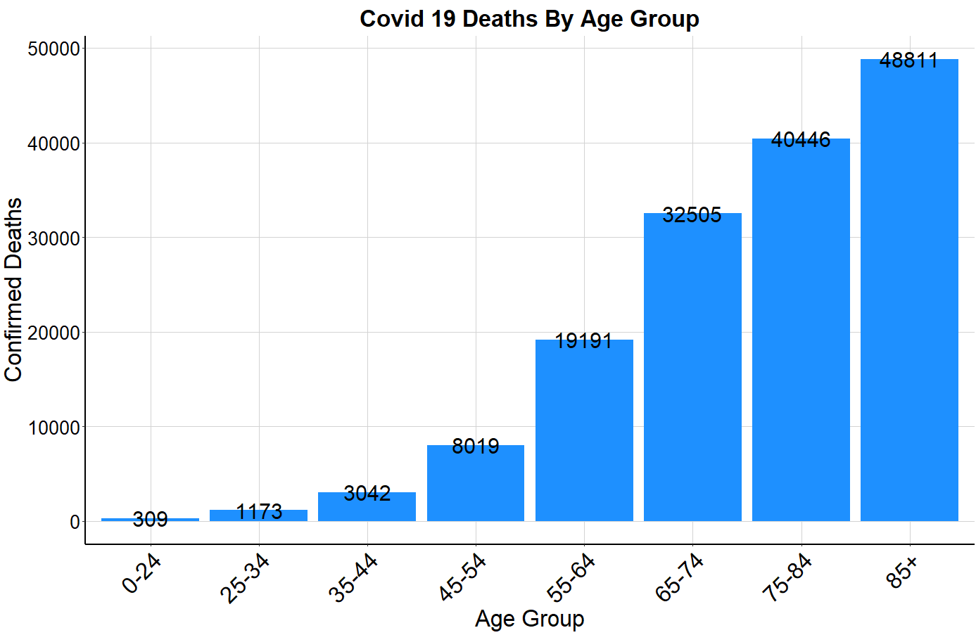
**The CDC Age Group data set accounts for 153 thousand USA deaths out of the 183 thousand total USA deaths
When analyzing how comorbidities play into COVID-19 deaths, the CDC reported that “for 6% of the deaths, Covid-19 was the only cause mentioned. For deaths with conditions or causes in addition to Covid-19, on average, there were 2.6 additional conditions or causes per death.” The below charts show the number of deaths tied to each of several common comorbidities in the United States, first by all Americans, and then broken down by each age group. Perhaps the most threatening comorbidity is diabetes, as 10% of Americans have diabetes but about 27% of COVID-19 deaths were of diabetics. Furthermore, each comorbidity affects each age group at a different rate.
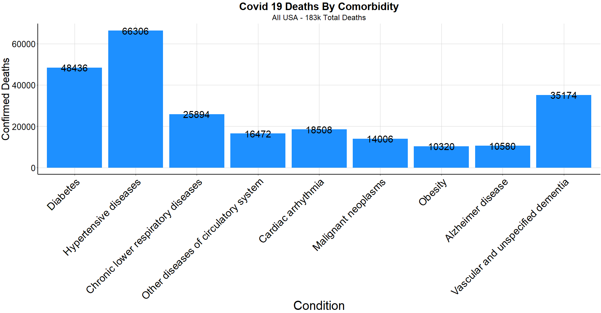
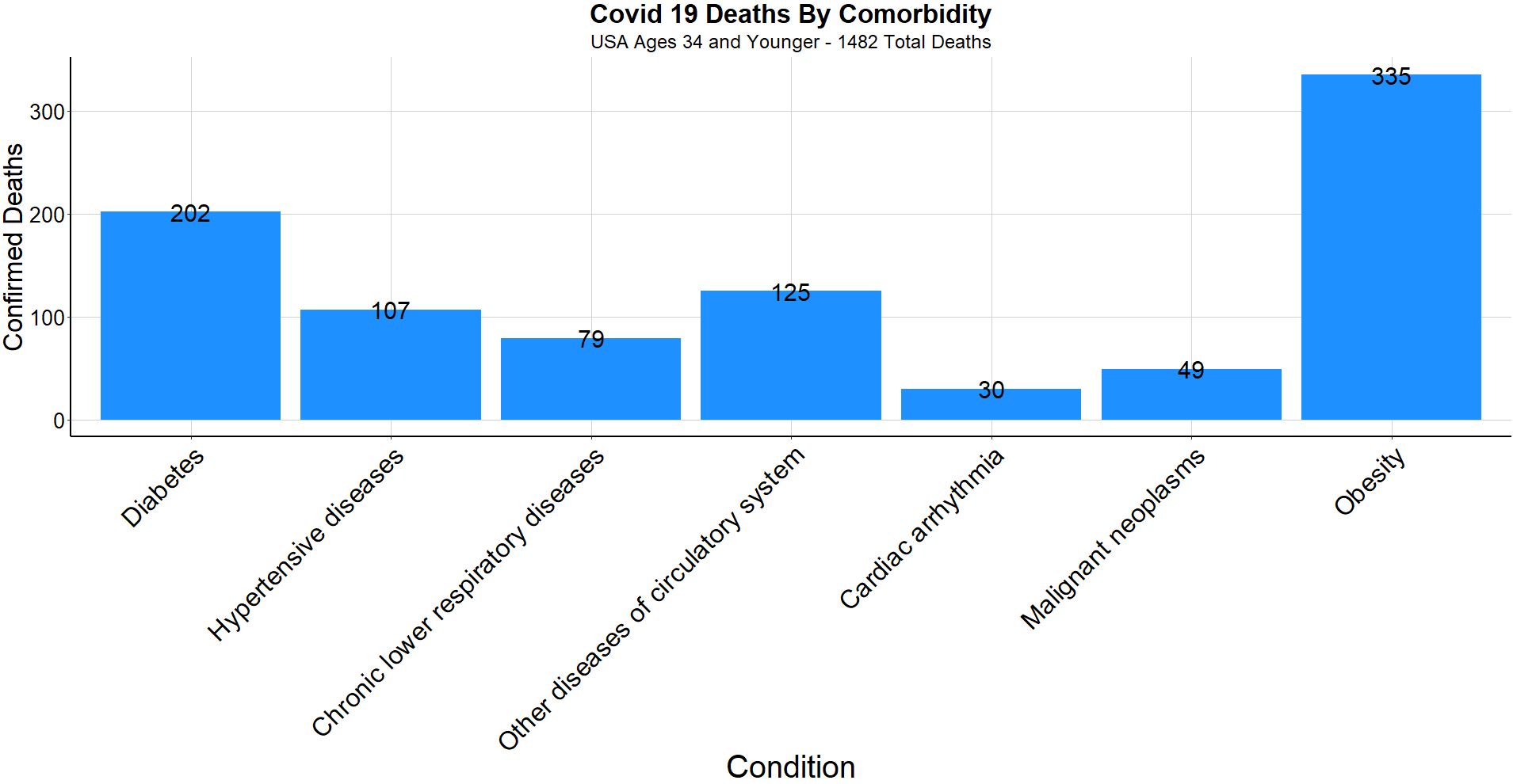
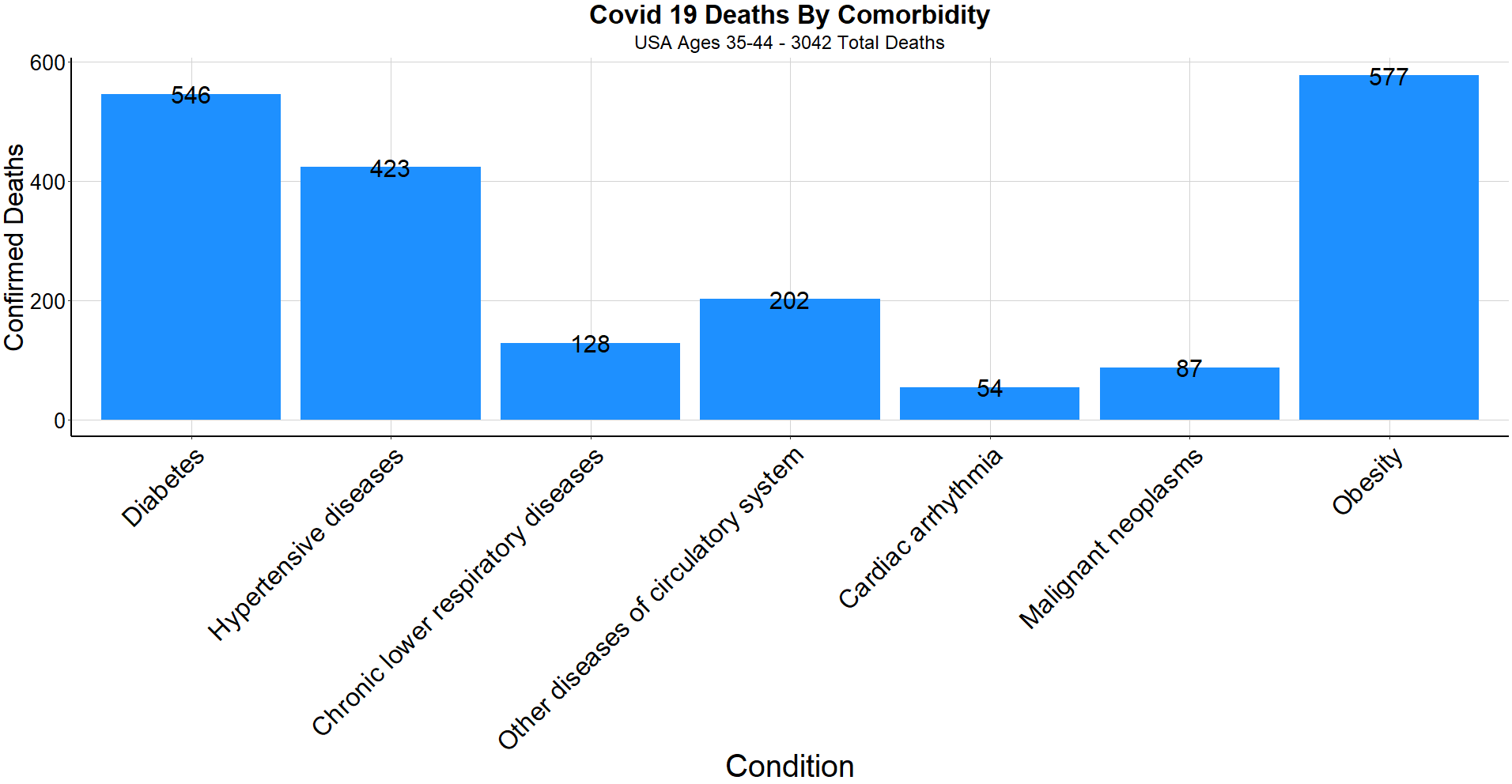
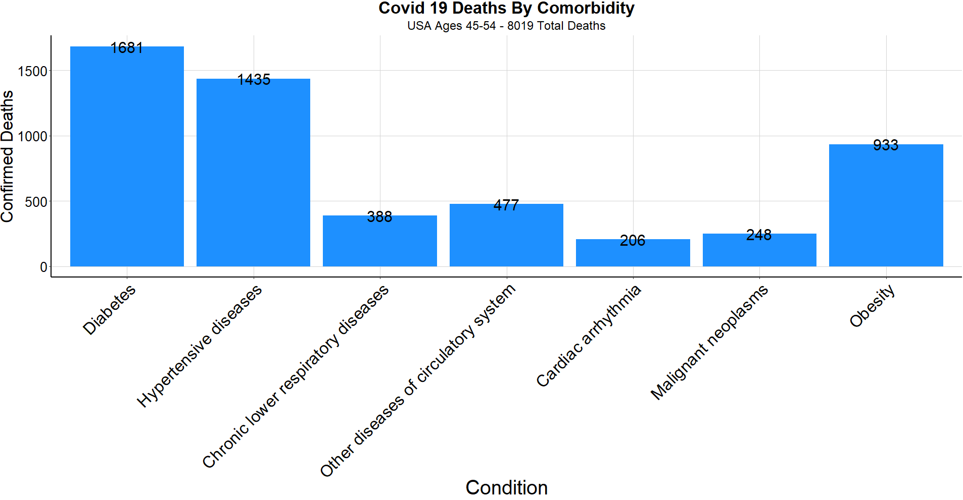
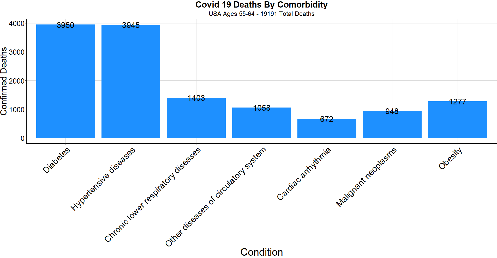
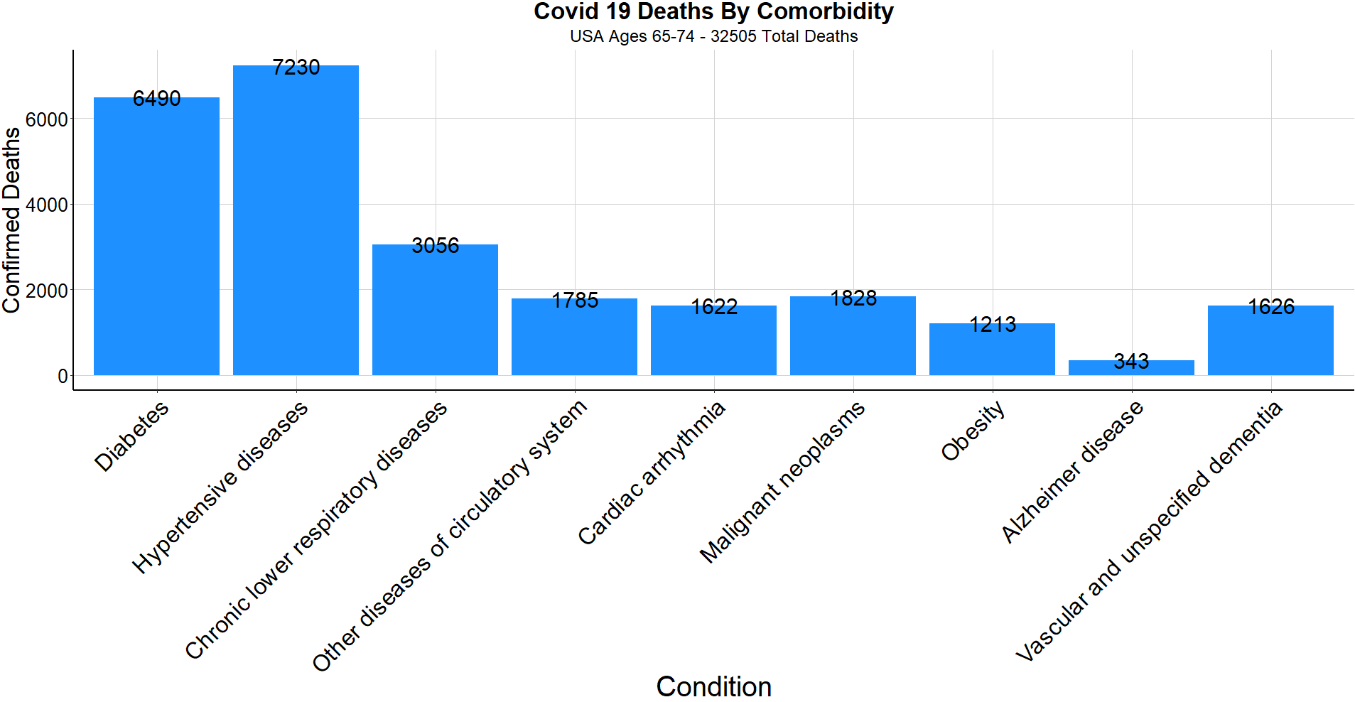
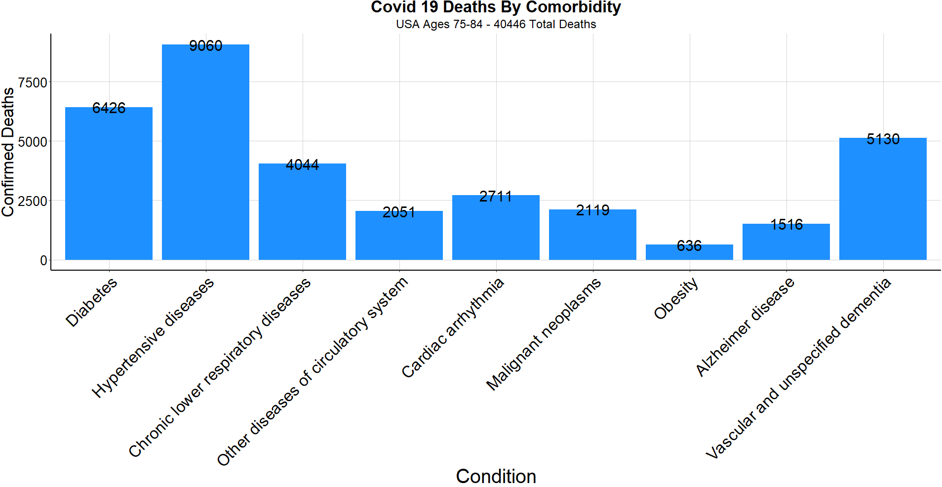
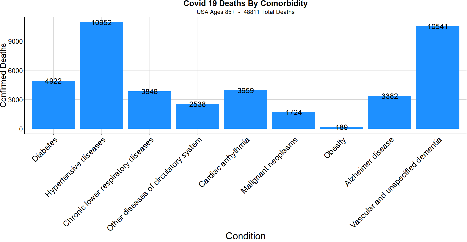
With 94% of COVID-19 deaths involving at least one comorbidity and < 1% of deaths being under the age of 35, the estimated number of American mortalities under age 35 with no comorbidities is approximately 110 people. This is not to downplay the seriousness of the virus responsible for the loss of 840 thousand lives around the world, but to provide insight to the attributes that increase or decrease an individual’s level of risk.
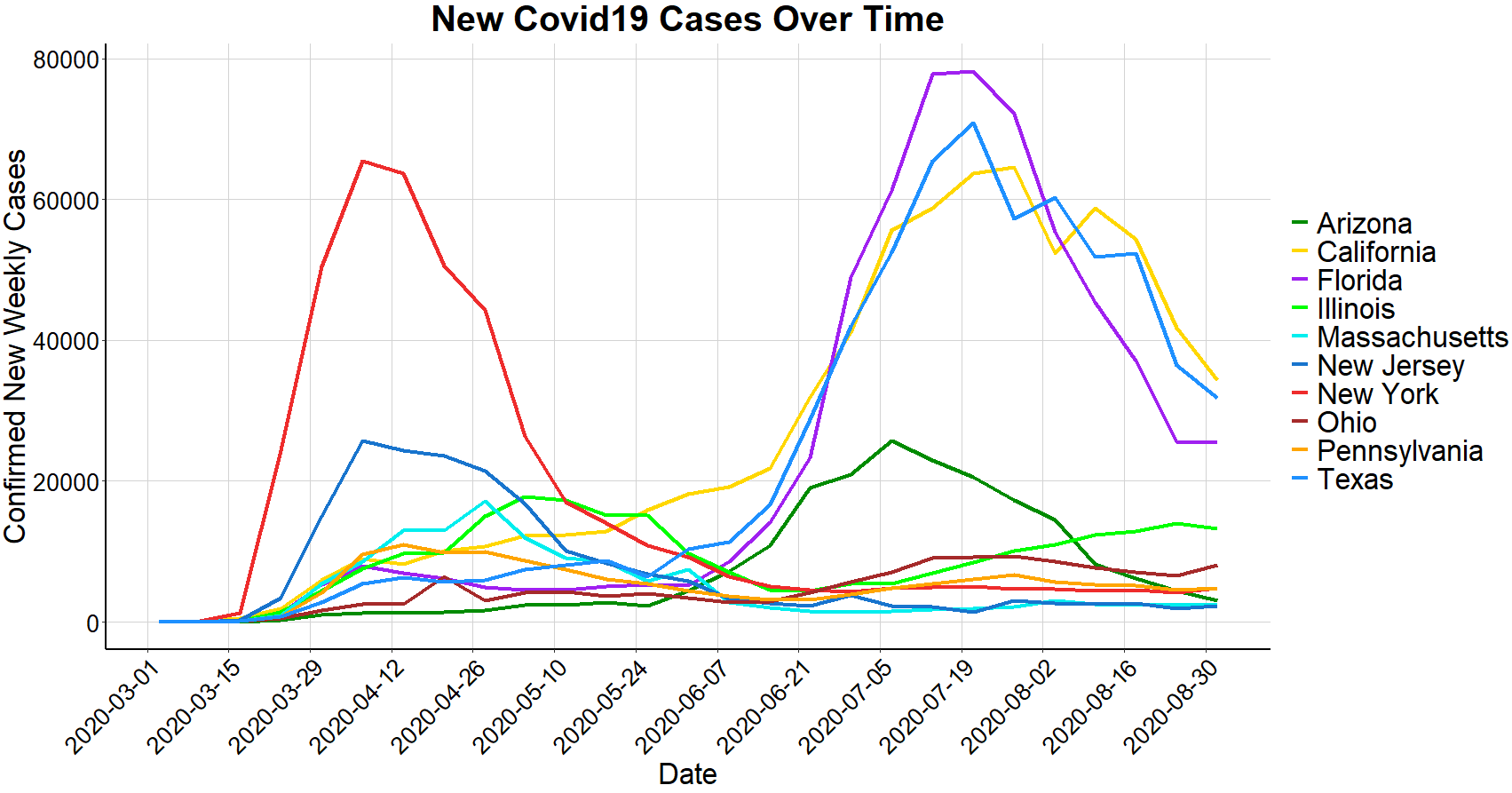
Next, we’ll break down COVID-19 statistics state by state within the United States. The below plot shows total cases per week among several of the hardest hit states. As mentioned previously, using total cases and ignoring deaths can be deceiving and distort comparability. Below is an unadjusted plot similar to those used in some reports that have overexaggerated the virus’s impact in Florida.
A more representative graph to depict Florida’s comparability to other states is the total deaths per million. The below graph shows each state’s deaths per million as opposed to above which strictly represents number of positive cases. As seen above, Florida surpassed New York in total cases, but as seen below, Florida’s deaths per million is about one-quarter of that of New York and New Jersey. California and Texas are in similar company to Florida while Massachusetts is comparable to its Northeast neighbors.
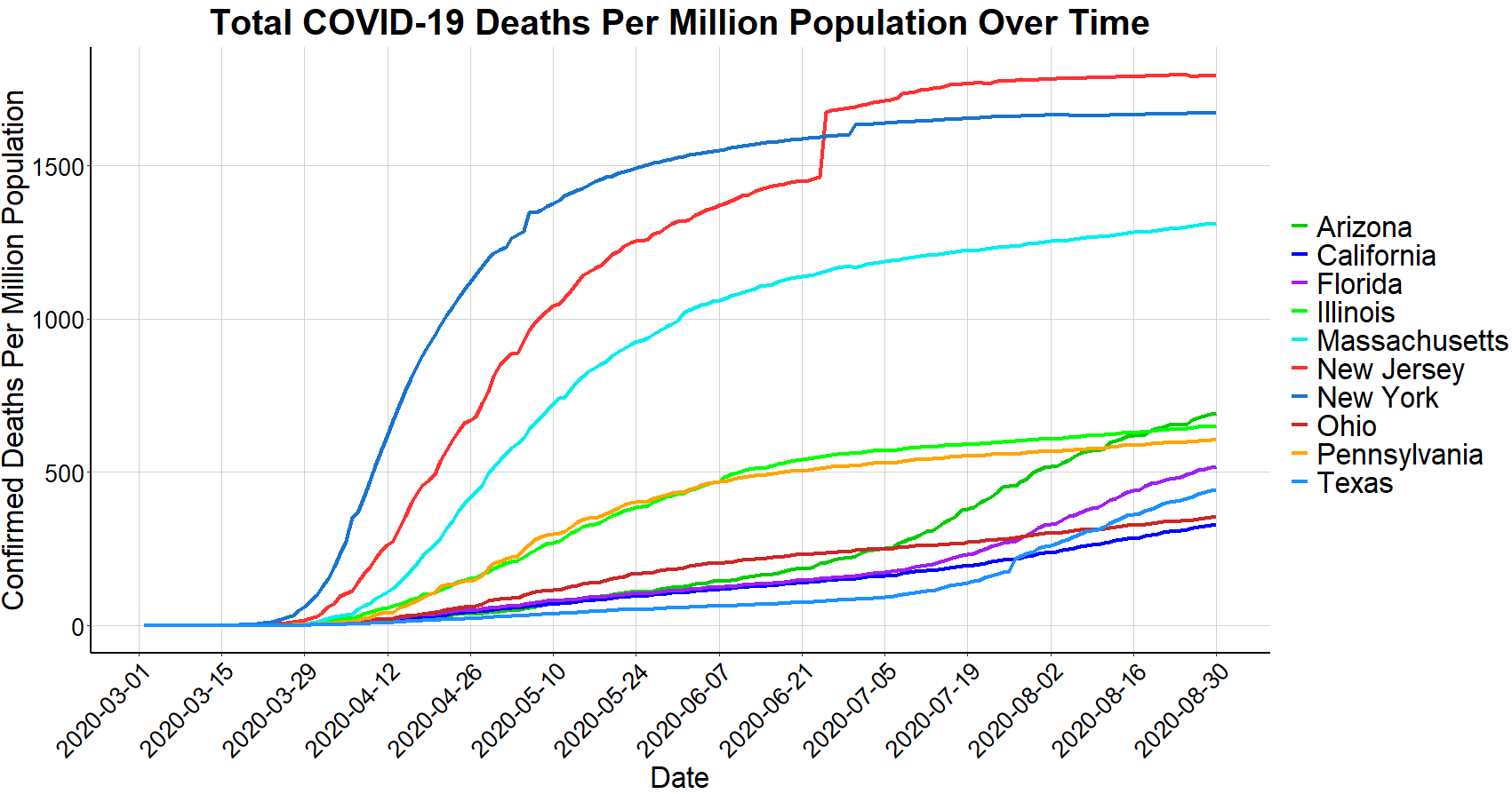
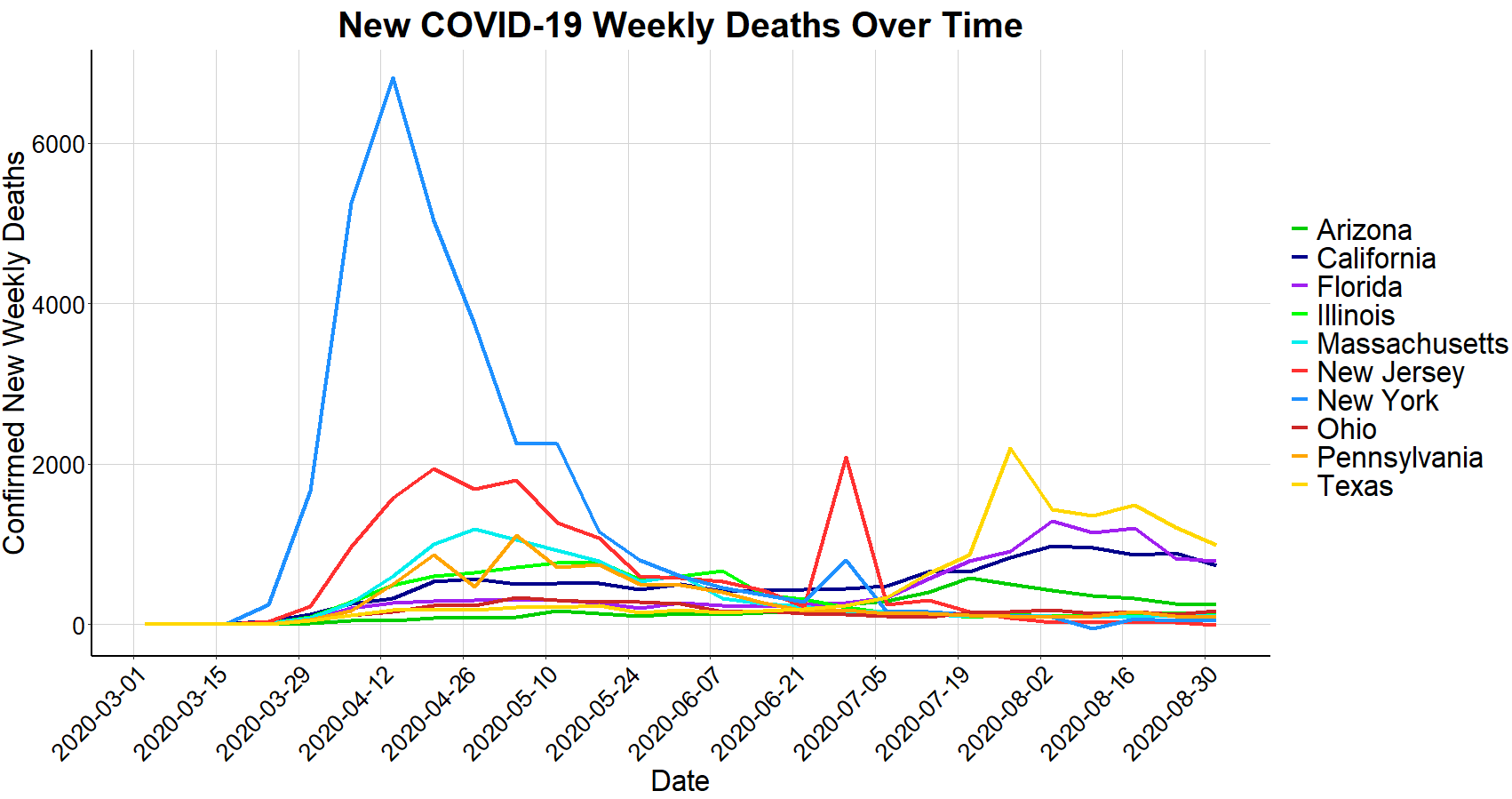
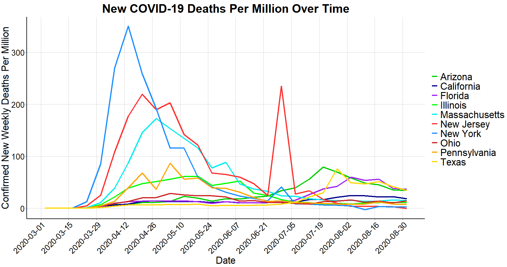
Despite New York’s significant number of deaths shown above, the New York Times reported that New York ‘beat the virus’. In doing so, the standard of success has shifted from minimizing deaths to minimizing the timeframe. By looking below at new deaths per week (both absolute and population adjusted) for each of these states, the importance of ‘flattening the curve’ becomes apparent. New York did not flatten their curve resulting in the highest spike of deaths, albeit a shorter window of high death rates.
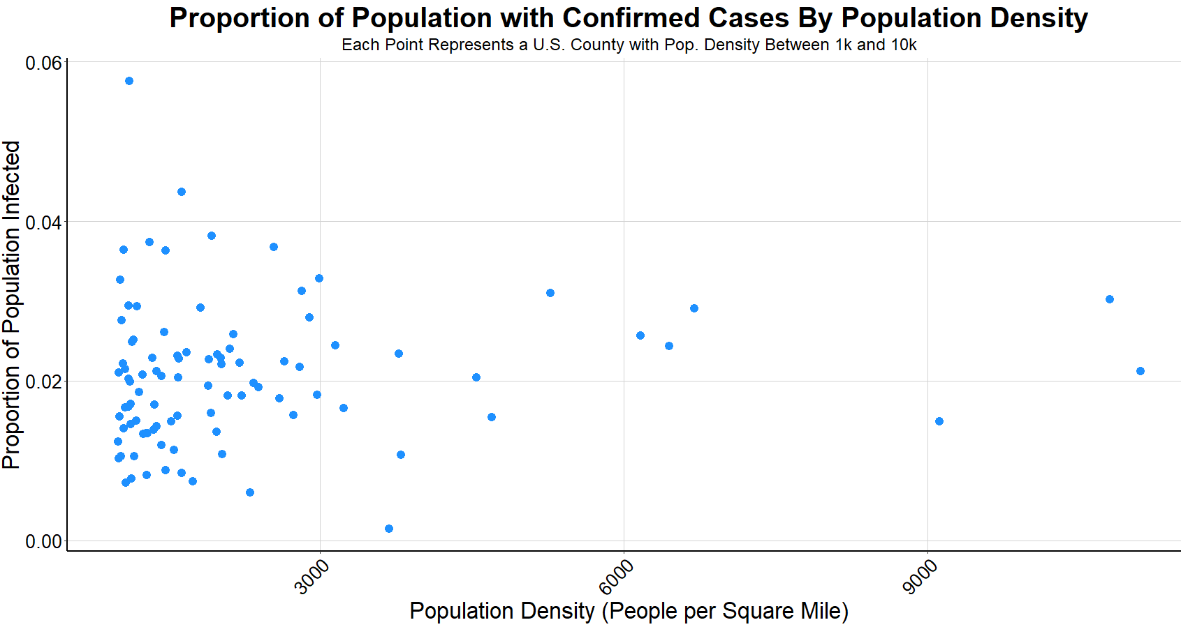
With Florida, Texas, California, and New York all showing comparable waves of COVID-19 cases, there are a few possible theories as to why New York has almost as many deaths as the other 3 states combined. One theory is that New York City is the most densely populated major city in America. However, the below chart shows that population density has no correlation to the percentage of a population that will be infected. Each point in the graph represents a county in the U.S. between the population density between 1000 people per square mile and 10,000 (to remove outliers). San Francisco, the city with the 2nd highest population density after New York City, has a low number of cases and deaths compared to other major American cities. The Citizens Housing Planning Council of New York City has reported that even within New York City, population density of each borough has no correlation to cases, suggesting that attributing high volume of COVID-19 cases to population density is innacurate. While it’s more difficult to show with data, other theories surrounding the likely cause of New York’s steep outbreak include a high number of introductions to the virus and virus containment strategy.
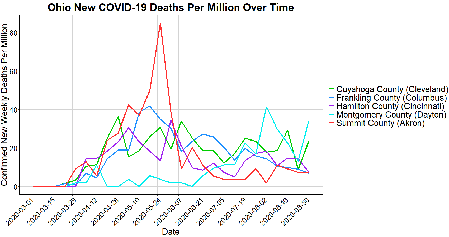
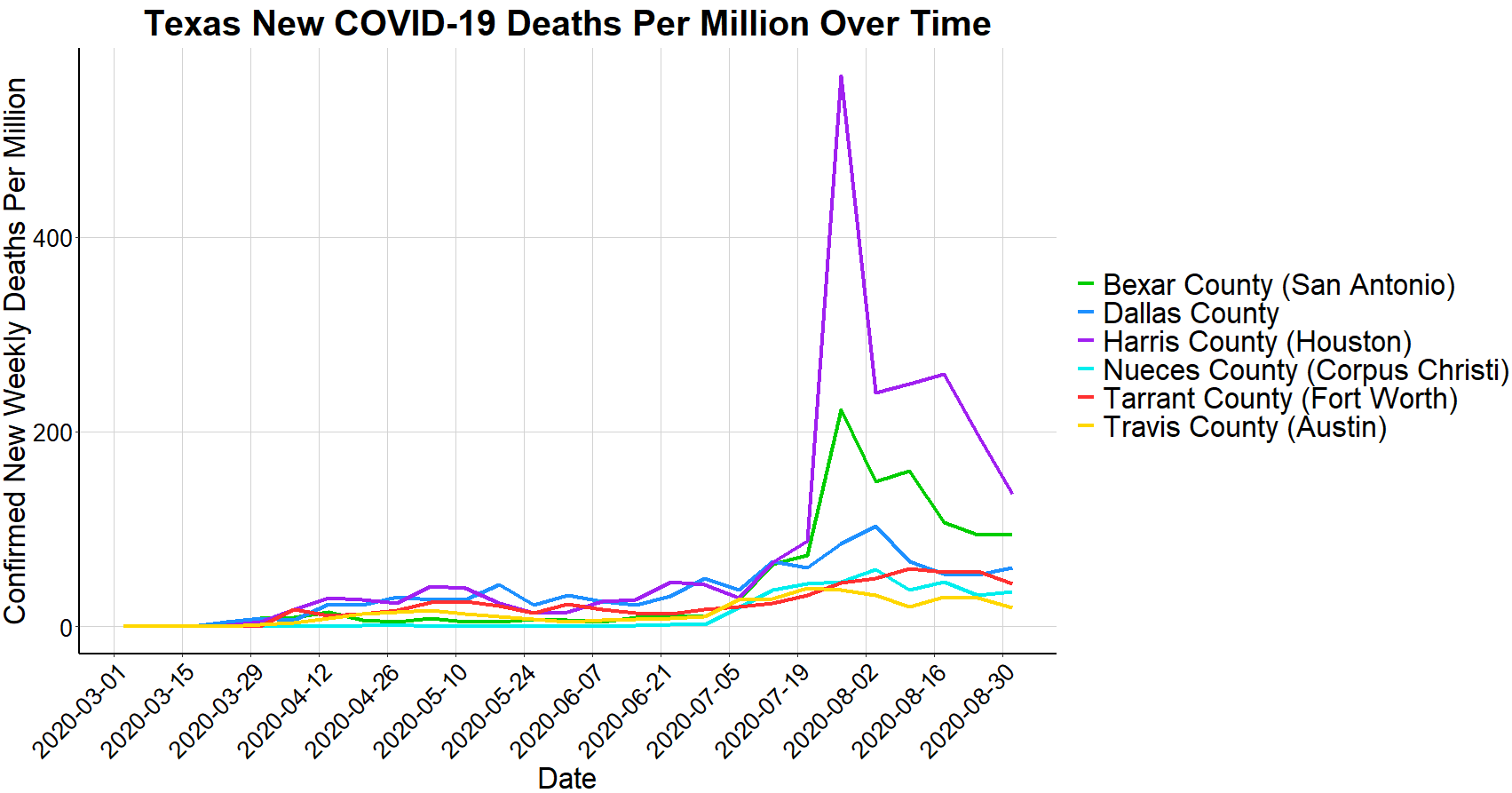
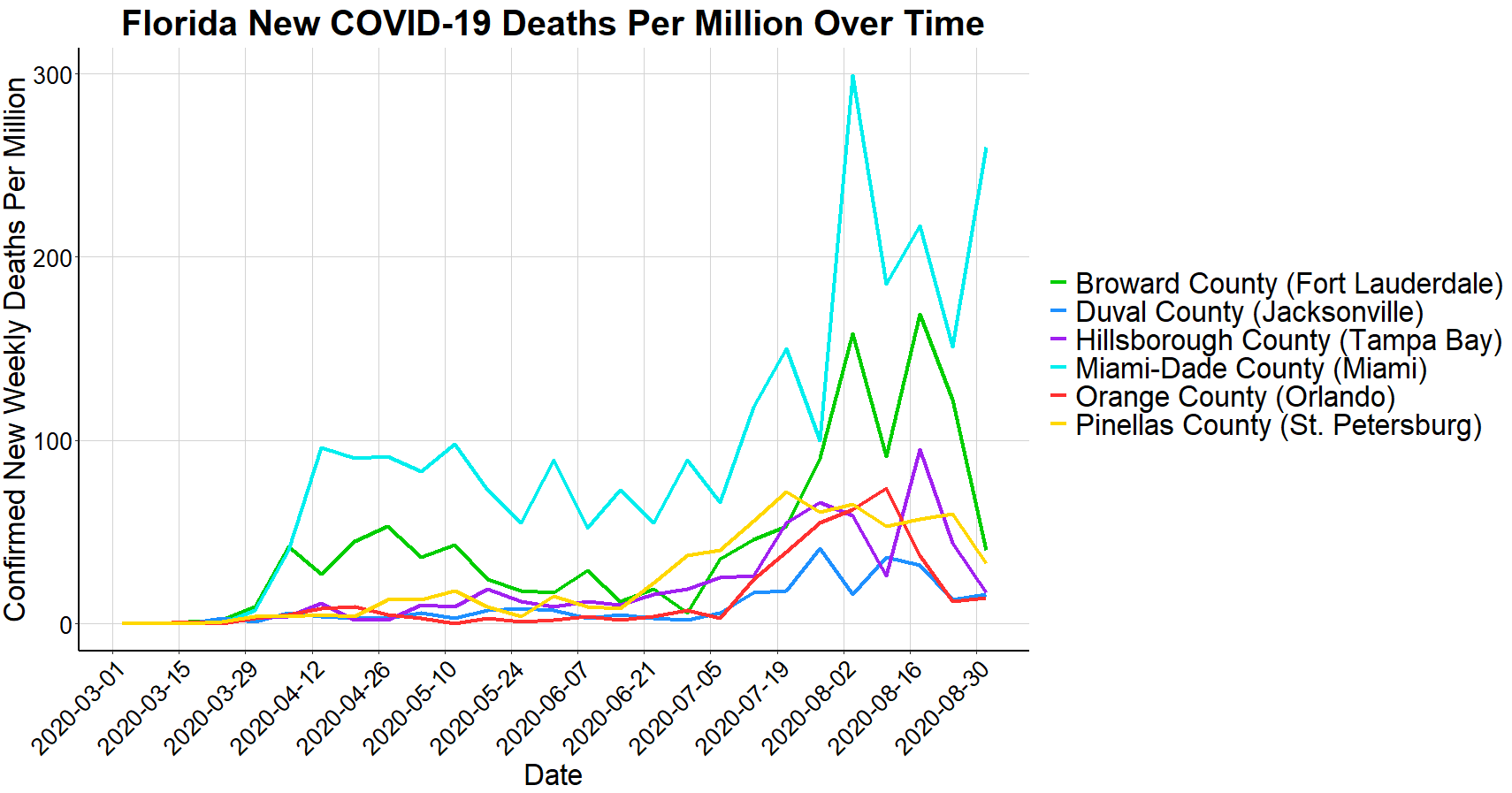
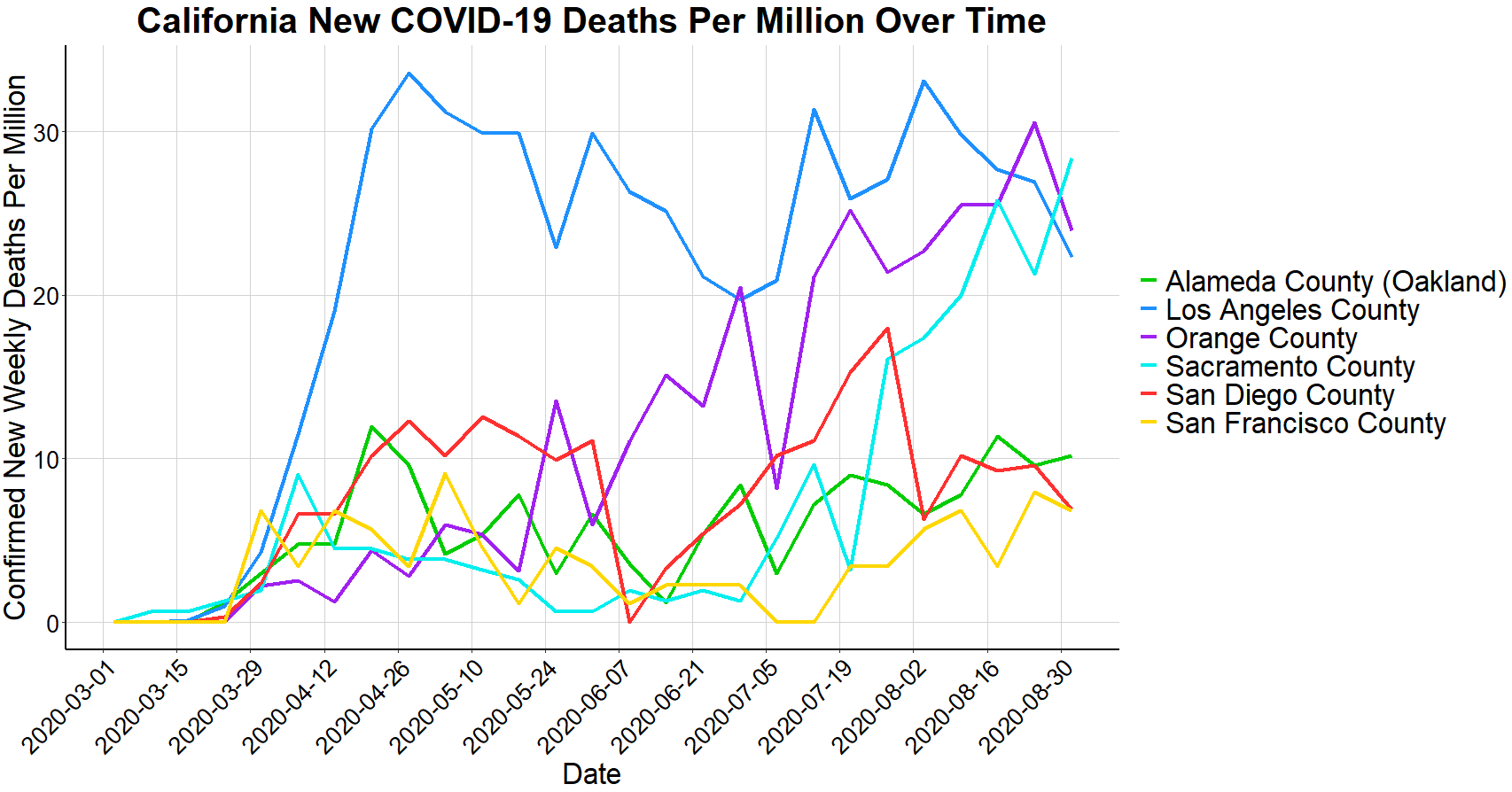
To assess the relationship that the virus has among cities within a state, the final charts below show a breakdown of a few selective states that have had high quantity of cases and have highly populated cities within their state. Notably, in Ohio, there was little correlation between the timeframe of deaths when comparing the major cities, as many cities experienced their highest death rates at different times. On the other hand, in Texas and Florida there appears to be more correlation of the death rates from city to city over time and in California, Los Angeles has maintained significantly higher death rates than other cities within the state for the majority of the past 6 months.
Each city, state, country, and continent has been impacted by and dealt with COVID-19 in different ways. The data that’s been collected is an extremely powerful tool to use when drawing conclusions related to COVID-19 and when making decisions on how to best mitigate the virus moving forward. Misinterpreting data or excluding pivotal information can lead to flawed conclusions or counterproductive decision making. To make the best use of data, it’s important to absorb all available information and to settle on a consistent standard of success.
Thanks for reading! Feel free to reach out with any suggestions, feedback, or questions at abmalter12@gmail.com.
Data Sources:
COVID-19 Cases and Deaths: Data.World
COVID-19 Age Demographics and Comorbidities: Centers for Disease Control and Prevention
U.S. Population Data: U.S. Census Bureau
World Population Data: United Nations